This is a continuation of ‘How to Create a Project Server Resource Utilization Report – #1 Data Connections‘.
If you followed my last article on this you should now have an Excel file with a data connection to the Project Server which is half the battle, but now we’ve got to set up the Pivot Table to show something useful and we have to style it so that it will provide value at a glance.
This article will cover the full setup for the Pivot Table and getting it styled up to a useable format. Once done you’ll be able to easily extend this to show other useful info such as how much of your companies total resource is assigned to projects and the likes.
Setting up the Pivot Table
By this point Excel will have created a Pivot Table for you but you now need to select what fields to use and how to use them. To get it looking like the image above you’ll need to set it up as follows –
- Right-click the Pivot Table and select “Show Field List” if it’s not displaying already.
- Expand both the “AssignmentTimephasedDataSet” and the “Resources” table so that it shows the fields.
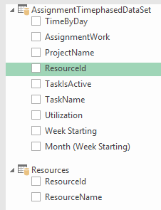
- Drag the columns down into the different sections as shown below, In the COLUMNS section ignore everything but Week Starting.
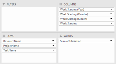
- Left click on ‘Week Starting (Year)’ and click ‘Remove Field’, do the same for ‘Week Starting (Quarter)’ and ‘Week Starting (Month)’.
- Now close the ‘PivotTable Fields’ window by clicking the small gray X at the top-right.
You’ve now got a messy Pivot Table which will be showing accurate data. Now we need to format it so that it’s easy to use and informative.
Styling up the Pivot Table
- To start right click one of the resource names in the Pivot Table, click ‘Expand/Collapse’ and select ‘Collapse Entire Field’ which should make the table a bit easier on the eyes.
- Expand the ‘Design’ tab in the PivotTable Tools ribbon. If you can’t see this click anywhere in the Pivot Table and it should appear.
- Click Subtotals and select ‘Show all Subtotals at Top of Group’. This will roll up all tasks assigned to a resource into a total percentage.

- Click ‘Grand Total’s in the ribbon and select “Off for Rows and Columns”.
- Select all of the values in the table including the column headings and center align them all.
- Select all columns in the sheet using CTRL + A, click Format and then click ‘Row Height’ change the value to 18.
- Do the same again, this time selecting ‘Column Width’ and change the value to 15.
- Select all of the Pivot Table date headings then click ‘Date’ in the Home ribbon and select ‘More Number Formats’. Click ‘Custom’ as the category and you can then change the format of the heading. I went with ‘dd/mm’.
- Finally change the style to whatever you prefer. To get it look exactly like mine you’ll need to select ‘Pivot Style Medium 13’.
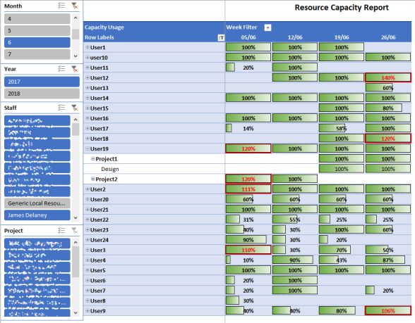
Now you will have a Pivot Table with some basic style that should look relatively tidy. Next we’ll set up Conditional Filters to get graphical bars for the percentages and to highlight any slots where a resource is overbooked.
Conditional Formatting
Now we’ll set up Conditional Formatting which will allow us to show a graphical bar respresentation like this –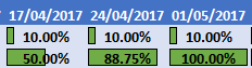
We’ll also set up formatting to highlight any overbooked slots similar to below –
- To start select any value in the Pivot Table.
- Expand the ‘Home’ tab in the ribbon then click ‘Conditional Formatting’.
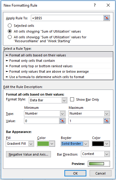
- Click ‘New Rule’ and set up the rule exactly like the image below (don’t worry about the ‘Apply Rule To:’ field –
- Once done you should now have bars on all values in the table which should already make the table more presentable, now we’ll create the second filter which will highlight any overbookings.
- Create a new Conditional Formatting using the following settings –

- Once done click ‘Format…’ and change the font colour to red and the background colour to red. Then click OK to finish.
Filtering with Slicers
Slicers allow you to filter a Pivot Table based on certain values, I’m using slicers to filter based on Month, Year, Staff and Project but I’ll cover setting up a single one and you should be able to easily create more for whatever filter you require.
- Select the Pivot Table and then expand the ‘Analyze’ ribbon.
- Click ‘Insert Slicer’ and select the ‘Week Starting (Month’ field.
- The slicer can now be moved or modified as required and will filter the Pivot Table.
From here you can add new slicers as required until you’re happy, I personally went with Month, Year, Resource and Project which gives me the following –

Hopefully this helps a few of you out there, if there’s anything I didn’t explain clearly or if you need further help don’t hesitate to comment below.

One thought on “How to Create a Project Server Resource Utilization Report – #2 Setting up Pivot Table and Styling”